Opening the Riviera Window
Sunlight pours across a stylized crescent of coast. A sweep of blue sea meets pale façades and palm‑rimmed terraces, while somewhere out of sight a train arrives, imagined in rhythm more than seen. The poster titled “Monaco – Monte Carlo – French Riviera,” attributed to E. Clérissi, reads like a window thrown open to air and brightness. It asks the eye to wander and the mind to follow.
The Riviera in this image is both destination and dream. Gentle curves, confident diagonals, and blocks of luminous color compress the sensations of Mediterranean light into a single, inviting surface. Everything looks unhurried, composed, and assured.
A few words suffice. Sun. Sea. Leisure.
And then the promise of arrival, printed in handsome type: Monaco, Monte‑Carlo. The place names themselves feel like a ticket.
Interwar Europe and the Rise of Destination Posters
The 1920s and 1930s formed a golden period for travel advertising in Europe. Railways reached coastlines and mountain passes with new comfort and speed. Tourism boards and railway companies commissioned artists to picture journeys as beautifully as possible, filling station concourses and travel agencies with bold lithographs.
The Riviera was a natural subject. Mild winters drew aristocrats and socialites, while summers brimmed with open water, promenades, and sunlit casinos. Posters presented these scenes in idealized form: cloudless skies, well‑dressed strollers, inviting beaches. They were invitations in paper, each line pointing toward departure.
Interwar posters fit modern life to modern design. Geometry and clarity matched the technologies that made travel practical. But these prints also offered escape—an armchair journey before the journey. A glance could send a traveler imagining salt air and the quiet shuffle of cards on green baize.
E. Clérissi and the Art Deco Poster Tradition
E. Clérissi worked within this brisk current of design. His name appears across listings for travel‑themed posters in the early twentieth century, and the Monaco–Monte Carlo print aligns with the aesthetic language that defined the Art Deco era: bright color, simplified forms, and elegance distilled into structure.
The poster stands among peers that condensed places into striking silhouettes and sun‑baked palettes. Architecture becomes a set of planes. Hills become smooth gradients. People, if shown at all, are rendered with poise and minimal detail. Everything speaks through balance.
A Concise Profile of the Artist
Details of Clérissi’s life remain spare in commercial sources, but his authorship here is widely cited. The work associates him with the period’s travel illustration, where artists translated destinations into emblematic images. What counts on the sheet is the surety of the hand: practiced economy, confident structure, and a feel for coastal light.
This is a maker who understood what a poster must do at distance. Be legible. Be alluring. Entice without fuss.
A Visual Language of Escape
The image communicates in a visual shorthand that travelers of the 1930s would have read instantly. Sky, sea, architecture, vegetation—each reduced to essentials, then harmonized. The effect is not photographic accuracy but distilled memory, the way a place settles in the mind after a perfect day.
The poster does not argue. It suggests. A single glance is enough to sense the warm flagstones, the shy shimmer of heat at midday, the ceremonious glow of evening façades over harbor water.
Color Light and Clean Geometry
Color carries the mood. Broad fields of blue and cream, warmed by ochre and terracotta, create the Riviera’s famous clarity. Sunlight seems to rinse every surface, flattening shadow while sharpening contrast. The sea appears immense yet calm, a dense ultramarine sliding to paler bands near shore.
Geometry keeps everything poised. Terraces hold their edges. Balustrades present crisp rails. Hills gather into gentle wedges and arcs. Curves guide the eye seaward, then back to the architecture perched above the coast. The composition reads almost like an engineered itinerary: look here, then there, then outward to the horizon.
Line is spare, never fussy. Planes carry the weight.
Luxury Leisure and Aspirational Mood
The poster’s language is aspiration made amiable. It hints at the pleasures that built Monaco and Monte‑Carlo’s renown: gaming rooms lit like salons, waterside cafés, satin evenings on promenades, and mornings on pale sand. Even when human figures are absent, the spaces feel occupied by elegant habit.
Luxury here is an atmosphere rather than an inventory. A white hotel frontage conveys as much as any catalog of amenities. A path traced across a cliff suggests arrival by rail and departure by yacht. Quietly, the image proposes a holiday that glides from terrace to shoreline and back again.
You can almost hear ice chiming in a glass.
Monaco and Monte Carlo As Icons of Pleasure
Few place names conjure leisure as immediately as Monaco and Monte‑Carlo. The principality’s compact geography heightens the drama: steep slopes descending to a tight harbor; architecture layered in steps; grand façades angled to swallow light by day and spill it at night. A poster needs only a handful of elements—a cornice, a curve of quay, a palm—to identify the place.
Monte‑Carlo carries its own shorthand: the casino, formal gardens, evening wear and impeccable manners, rooms where luck is a guest and suspense is decor. Set against the sea, these signals form a stage where travelers imagined themselves as polished actors. The Clérissi poster offers that stage simplified to its essentials, ready for the viewer’s entrance.
Even the spacing between elements feels theatrical. A pause. Then a reveal.
How Tourism Boards and Railways Sold the Riviera
Posters of this type occupied hub locations where decisions were made. Station walls, ticket offices, and travel bureaus became galleries of persuasion. Tourism authorities commissioned artists to condense climate, architecture, and ambience into single sheets that could catch a hurried glance and turn it into a longing.
Railway companies used the same art to give their routes a sense of destination beyond timetables and carriage classes. A sunlit coast at the end of a steel line promised that the journey would transform routine into leisure. The posters spoke to travelers with means—those who could act on impulse, reserve a compartment, and arrive two days later among palms and colonnades.
Printing techniques supported the message. Flat areas of saturated color, common to lithography of the period, created images that read with force from several meters away. Typography balanced romance with clarity, stating names with the firmness of a ticket stamp.
The sale was simple: here is the world you want, and here is the route to reach it.
From Original Design to Modern Reproductions
The design attributed to E. Clérissi dates to the 1930s, part of that radiant sequence of interwar travel advertisements. Original impressions would have circulated in limited, functional runs, meant to work hard in public space and then yield to the next season’s campaign.
Today, the design lives again through reproductions. Its clarity and warmth adapt well to contemporary printing, allowing the image to pass from concourses of the past into modern interiors. What was once an instrument of persuasion now reads as both decoration and historical fragment, a fragment that still whispers of trains and blue water.
Reproduction does more than copy. It reenacts an invitation.
Reproductions Available Today
Commercial listings on major marketplaces and fine‑art print shops present this poster as a reproduction or master art print rather than an original archival pull. The phrasing is consistent: modern prints based on the historic design, available in varied sizes and substrates.
Shoppers encounter it on familiar platforms—Amazon, eBay—and through specialty vendors of vintage‑style graphics. The image is resilient to scale; its clean planes and sure contrasts hold whether printed as a modest sheet or a large statement for a wall.
Authenticity here means fidelity to the look and spirit of the 1930s sheet. The paper may be new, but the Riviera it reveals feels unchanged.
Enduring Appeal and Cultural Legacy
Why does this image continue to attract the eye? Partly because Art Deco poster language sits at a sweet point between style and legibility. It does not bury the subject in ornament, nor does it strip away charm. The balance pleases rooms and viewers alike.
There is also continuity in desire. The Riviera promised sunlight, blue water, measured pleasure, and the soft theater of evenings well spent. Those desires have not altered much. A poster that compresses them into geometry and color remains persuasive, even if the viewer never buys a train ticket.
Designers still study prints like this for lessons in hierarchy and economy. How many shapes are truly needed? Where should the strongest contrast fall? How can type and image cooperate without quarrel? The poster offers answers in crisp, teachable terms.
Collectors value the image for what it carries forward: a chapter of travel history, the sheen of interwar style, and the fantasy of leisure perfected. Interiors welcome it for its glow.
It brightens a wall in winter.
Closing Reflections on a Timeless Image
Stand before the Clérissi poster and let the composition do its work. Your eye crosses pale terraces toward the blue. The names—Monaco, Monte‑Carlo—settle like a vow. Somewhere, a train doors open and the first breath of sea air reaches the platform.
The poster keeps speaking long after the station wall is gone. It keeps selling the same promise in a softer voice: sun, rest, and the gentle cadence of days by the water. That is why reproductions continue to circulate and why the original design, born for utility, now lives as an emblem.
A window, still open. A coast, still bright. A journey, always beginning again with a glance.
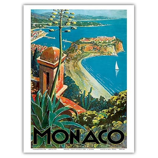
Monaco Vintage Travel Poster by E. Clerissi
Features
| Product Dimensions | 12 x 9 x 0.01 inches |
| Item Weight | 0.353 ounces |
| Manufacturer | Pacifica Island Art, Inc. |
| ASIN | B00EFEQTBQ |
| Item model number | PRTA3415 |
| Date First Available | September 25, 2015 |
Elevate Your Space with Monaco Vintage Travel Poster 🌍
Transform your walls into a stunning visual experience with the Monaco Vintage Travel Poster by E. Clerissi! This exquisite print, crafted on eco-friendly heavyweight paper, adds a touch of elegance to any room—be it your home, office, or creative studio.
🎨 Don’t miss out! Order your limited edition print today and embrace sustainable art that doesn’t compromise on quality. Click the link above to bring a slice of Monaco into your life!
Get Your Monaco Vintage Travel Poster Now!